SR 1 PAGE SEVENTY-SEVEN
Vicious looks a little wrong to me here, but I can’t exactly place what it is… This is only the third time we’ve seen her, so the design isn’t 100% nailed down yet. Her head is maybe too rectangular in those first couple panels? Almost Tess-like. Her chin should be pointier, at least.
Vicious Whisper’s design went through more mutations than any other supporting character. Want to see some ANCIENT doodles? Let’s go to the archive!
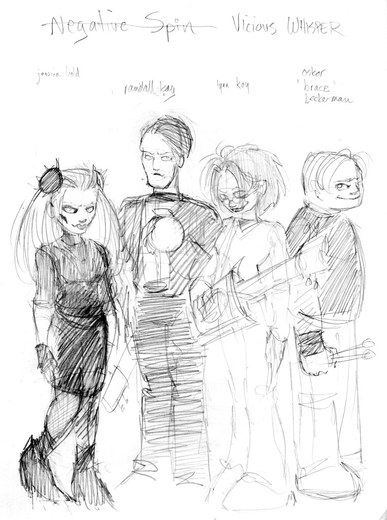
This little scribble (ca. 2000) is the first drawing of Vicious Whisper, back when it was the name of the band and not the person. “Jessica Hold” is pretty intimidating! (And it looks like she paints in some hollow cheeks like Svengoolie?) Can’t recall any specific reference points for this design, but Siouxsie Sioux and Debbie Harry are definitely there.
Lot of ZIM-era angularity in this 2001 drawing! Check out that crazy logo on the left. Imagine using that googly-eyed wackadoo as the icon for your shadowy synth-rock band.

Her lips look like a lil’ Hitler moustache, huh? Not ideal! Not sure who the guy covered in gore is… Possibly an early Rivet Hed? (BTW I have trademarked every one of the band names written there and if you use any of them you owe me seven billion dollars.)

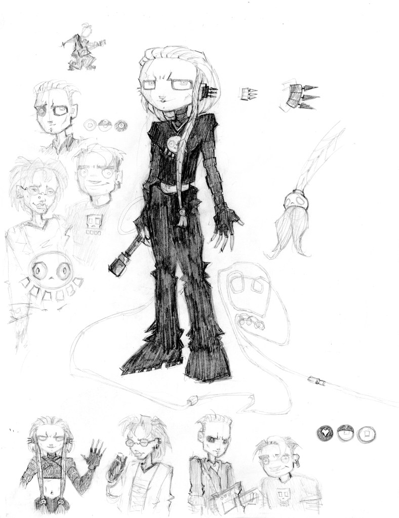
Okay, starting to look like our Vicious now. She’s got the pigtails and the skull shoes. Maybe even a hint of a smile now? The little doodle with the tree and cat suggests the personality we know is starting to form. The coziness…it builds…
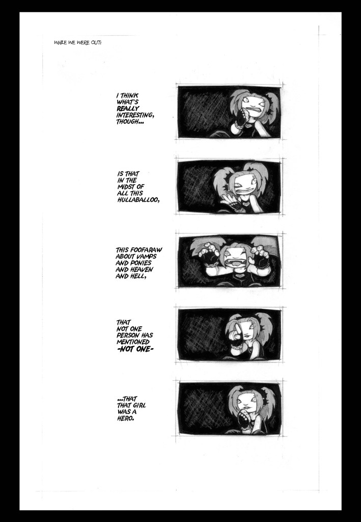
SR 1 PAGE SEVENTY-EIGHT
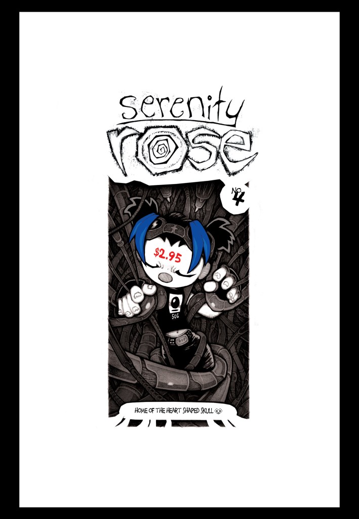
My favorite cover! I remember it made some retailers a little angry, though. The back cover was entirely black (with “i like you” in small white letters), and when the comics were bundled up and sent off to stores, a significant amount of that black ink bled off onto the pristine white covers. Now I think that added a cool scuffed texture to the covers – every one unique! – but some people chose to see them as “damaged” and got upset. This is their right. I, however, choose to see it as an unorthodox method of completing the printing process. Sort of like when KISS put their blood in the ink for that comic where they fight Dr. Doom.
Anyway! Seeing that big red “$2.95” on Sera’s head makes me wonder if that was a good price for a floppy comic issue in 2004.
Turns out: not bad!
I just looked it up, and your average Marvel/DC comic was, like, $2.25-$2.99 or so back then. That was for color, of course, but the big superhero boys got sweetheart deals from printers, so churning out color books was a lot cheaper for them than for indie houses like SLG. Marvel/DC also put ads in their comics, so, frankly, they probably could’ve scraped a few more pennies off that $2.25 if they really loved you.
But Marvel/DC don’t love you. Indie comics love you. Support small publishers!
BACK TO THE PRESENT!
This week was pretty horrifying for a lot of reasons, wasn’t it? Making art I care about helps take the edge off, though. Maybe you feel the same way? Just a little reminder to keep MAKING stuff.
Speaking of stuff I made: You’ve already seen this link to grab SHOCK CITY from a bunch of different stores, but if you’d prefer to get the book from your local comic shop, it’s in the PREVIEWS catalog now: LINKIE. I strongly support this choice! Comic shops are cool as hell!

NEXT WEEK: SAV-INI!


Leave a reply to denpen Cancel reply